Explore the Papyrus font, its history, uses, and why it often gets a bad rap from designers. Understand the debate around it and why it’s still in use today.
Introduction to Papyrus Font
Papyrus is a font that has sparked significant debate in the design world. Love it or hate it, there’s no denying its lasting impact. For many, it’s the typeface that evokes everything from ancient scrolls to modern movie posters. But, if you’ve spent any time in the design community, you probably know that Papyrus has its fair share of critics.
This article examines what makes Papyrus so divisive. We’ll dive into its history, the reasons why many designers dislike it, and what it’s still used for today. Along the way, we’ll also compare it to other widely-used fonts and answer some common questions about its use.
What is the Papyrus Font?
Papyrus is a display font, meaning it’s meant for use in short bursts—usually for titles, headings, or anything that needs to catch the eye. It was designed in 1982 by Chris Costello, a designer who wanted to capture the rough, handwritten feel of ancient Egyptian scrolls. It was first released by Letraset, a company known for producing fonts that could be transferred onto printed material, and has since been widely used in both digital and print media.
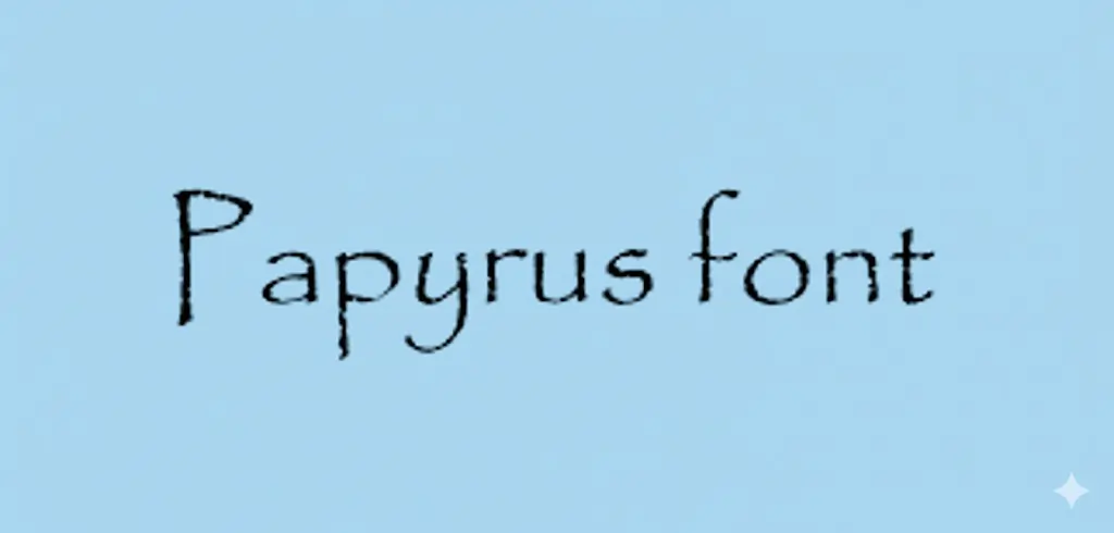
The font is easily recognizable due to its rough, organic appearance. The edges of each letter have uneven, jagged lines, almost as if they were carved into stone or written with a quill. This gives the font an aged, antique look, which is why it’s often used to evoke a sense of history or antiquity.
The Popularity and Criticism of Papyrus
Despite its origins as a tool for designers seeking to create a rustic, ancient feel, Papyrus has been both widely adopted and widely criticized. It became a popular choice for a time, appearing on everything from restaurant menus to book covers. However, it didn’t take long for many to feel that it was overused.
One of the most significant turning points for Papyrus was its use in the 2009 blockbuster movie Avatar. The film’s use of Papyrus for the title and subtitles made the font synonymous with anything “exotic” or “alien”—a fact many designers found frustrating. For those in the design community, seeing such a widely used font used in a high-budget, high-profile movie felt like a missed opportunity. The choice seemed lazy, and it amplified the idea that Papyrus was a font that didn’t deserve to be used on anything with serious branding.
Why Do Designers Dislike Papyrus?
Papyrus has earned its place as one of the most disliked fonts, but why? Here are some of the main reasons:
Overuse and Lack of Originality
Papyrus became so ubiquitous that it appeared everywhere, from greeting cards to corporate logos. The problem with overusing a font like Papyrus is that it loses its uniqueness and character. What was once considered a quirky, artistic typeface now feels like a default choice made by designers who don’t want to think too hard about their work.
This overuse is especially evident in areas where the font doesn’t fit, such as on professional websites, corporate materials, or other applications that require a clean, modern look. For instance, many people remember seeing Papyrus on posters and flyers for small businesses or community organizations that had no reason to use it. It wasn’t the font that suited the project—it was just a quick go-to choice that didn’t require much thought.
The “Cultural Cliché” Problem
Another significant criticism of Papyrus is its use to evoke “exoticism” or to represent ancient cultures. While it was initially intended to look like ancient writing, its use over the years has made it feel like a cheap representation of history and culture. It’s become the default font for anything related to the “old world,” whether it’s ancient Egypt, Greece, or even the “mystical” East.
In many cases, this over-simplification and overuse of Papyrus has led to accusations of cultural appropriation. The font has been used to make things feel ancient or otherworldly, with little regard for the specific cultures it’s meant to represent. This, in turn, makes the font feel lazy and tone-deaf rather than clever and thoughtful.
The “Avatar” Effect
If you’re familiar with the Avatar movie, you know exactly where this is going. The film’s use of Papyrus made the font even more recognizable, but not in a good way. Instead of being seen as an artistic choice, it became a symbol of poor design decisions. The use of Papyrus in a blockbuster film made people more aware of its frequent misuse in bad design, making it an easy target for criticism.
The Comic Sans Effect
Many people compare Papyrus to Comic Sans—a font that’s equally divisive. Both fonts are widely used and have earned reputations as “cheap” or “unsophisticated.” Comic Sans is often cited as the “go-to” for kids’ parties and informal communication, while Papyrus is often overused for ancient or rustic themes. Designers criticize both fonts for their inability to convey professionalism or seriousness when used in the wrong context.
When and Where Should You Use Papyrus?
Even though it has its critics, Papyrus can still be effective in certain situations. If you’re working on a project that requires a sense of history or ancient text, Papyrus might be the right font for the job. The key is to use it sparingly and appropriately.
Here are a few contexts where Papyrus might still be a good choice:
- Book Covers or Posters for Historical or Fantasy Novels: If your project involves ancient cultures, ruins, or mystical elements, Papyrus can lend the sense of an ancient text or document.
- Themed Events: If you’re designing invitations or materials for an event with a historical, cultural, or even a fantasy theme, Papyrus could be appropriate.
- Handmade or Natural Branding: In rare cases, Papyrus can work for brands seeking a rustic, handmade vibe. Think of natural product companies or eco-friendly businesses. But even then, you might want to consider alternatives before defaulting to Papyrus.
However, in almost every other situation, it’s best to avoid using this font.
Comparison with Other Fonts
Let’s take a look at some other fonts that designers use when they want a more professional or polished look. Comparing these fonts with Papyrus highlights why it’s best to avoid using it in most design work.
Arial
Arial is often considered a bland but functional font. It’s ubiquitous, just like Papyrus, but it doesn’t have the same cultural baggage. If you need a clean, modern typeface, Arial is a much safer choice. Unlike Papyrus, it doesn’t risk looking out of place on professional materials.
Times New Roman
Times New Roman is one of the most recognizable serif fonts. It’s often used in business and formal contexts. While it can come off as stuffy, it still conveys professionalism and seriousness—qualities that Papyrus lacks.
Garamond
Garamond is a classic font known for its elegant, readable style. It’s used in many professional designs and is far less divisive than Papyrus. If you need a font that conveys sophistication without being too stuffy, Garamond is a great choice.
Common Mistakes When Using Papyrus
If you decide to use Papyrus, make sure you’re not falling into these common traps:
- Overusing It: Don’t use Papyrus for every headline or in every corner of your design. Reserve it for special uses, like titles or headings.
- Misuse: Avoid using it for any corporate work, websites, or materials that need to look sleek and modern.
- Using It for Every “Ancient” Project: Not every ancient-world project needs to use Papyrus. Consider using a more subtle, refined font.
FAQs
1. Is the Avatar font actually Papyrus?
No, the font used in Avatar is a version of Papyrus, but with modifications to make it more distinct and unique to the film. The font used in the movie became iconic, but it’s still based on the original Papyrus design.
2. Is the Papyrus font free?
Papyrus is not free. It is a licensed font, but it is widely available for purchase. Many versions are bundled with software packages, and they can be found on various font distribution sites under a commercial license.
3. Is the Papyrus font overused?
Yes, Papyrus is considered overused by many designers. It became a default choice for projects that didn’t require much thought, and its overexposure has led to a negative reputation in the design world.
4. What is the Papyrus font used for?
Papyrus is typically used for display purposes, such as headlines, posters, and other applications that need a rustic, ancient, or “mystical” feel. It’s often seen in projects related to history, ancient themes, or fantasy genres.
5. What is Gen Z’s favorite font?
Gen Z tends to favor clean, modern fonts like Helvetica, Montserrat, and Poppins. These fonts are sleek, minimal, and versatile, often used in social media posts, logos, and other digital content.
Conclusion
Papyrus may always have a place in the hearts of some, but its overuse and misapplication have made it one of the most polarizing fonts in the design world. If you’re working on a project where a rustic, historical vibe is needed, it might still be useful—but proceed with caution. When in doubt, there are plenty of other typefaces that won’t carry the same negative baggage.
Be thoughtful with your font choices and consider the overall tone and context of your design. Fonts like Garamond or Arial may be more versatile for general use, and even though Papyrus might hold some nostalgic value, it’s often best left to the past.